
If you’ve ever dabbled in illustration apps you’ll know there’s a bit of a learning curve moving from real-world pencils and paintbrushes to digital ones. To help improve your technique, here are four pro tips from illustrator James Boswell to help kickstart your virtual painting skills.
“Whilst they might not help you become a better artist,” says James, “they’re all things I wish I’d known about when I started with Procreate.”
Note: these tips are based on the full version of Procreate ($10/£10) for iPad, but should still provide some insight for users of Procreate Pocket ($3/£3) for iPhone.
Brush StreamLining
The Quickline tool is great for marking out clean straight lines, and when it’s used in conjunction with the StreamLine line tool you can do some very precise work. In order to make a brush with smoothing (some have it already!) first create a new brush or duplicate an existing one. Next, open up the brush maker and under the stroke header, you’ll find a slider called Streamline.
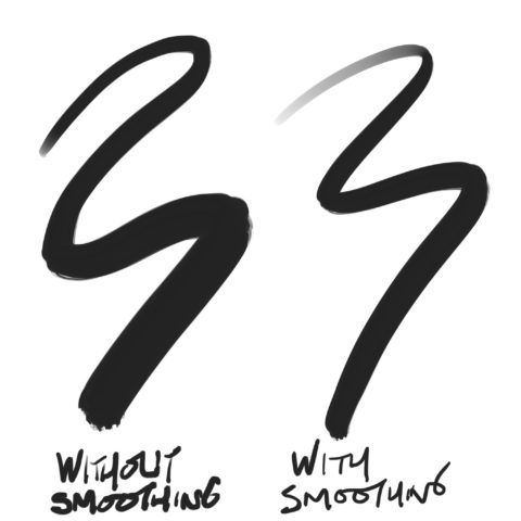
Then adjust the slider to define how smooth you’d like the stroke to be. This makes drawing flowing lines much easier. Things like wires, hair, edges of curved objects can now be drawn with much better definition.
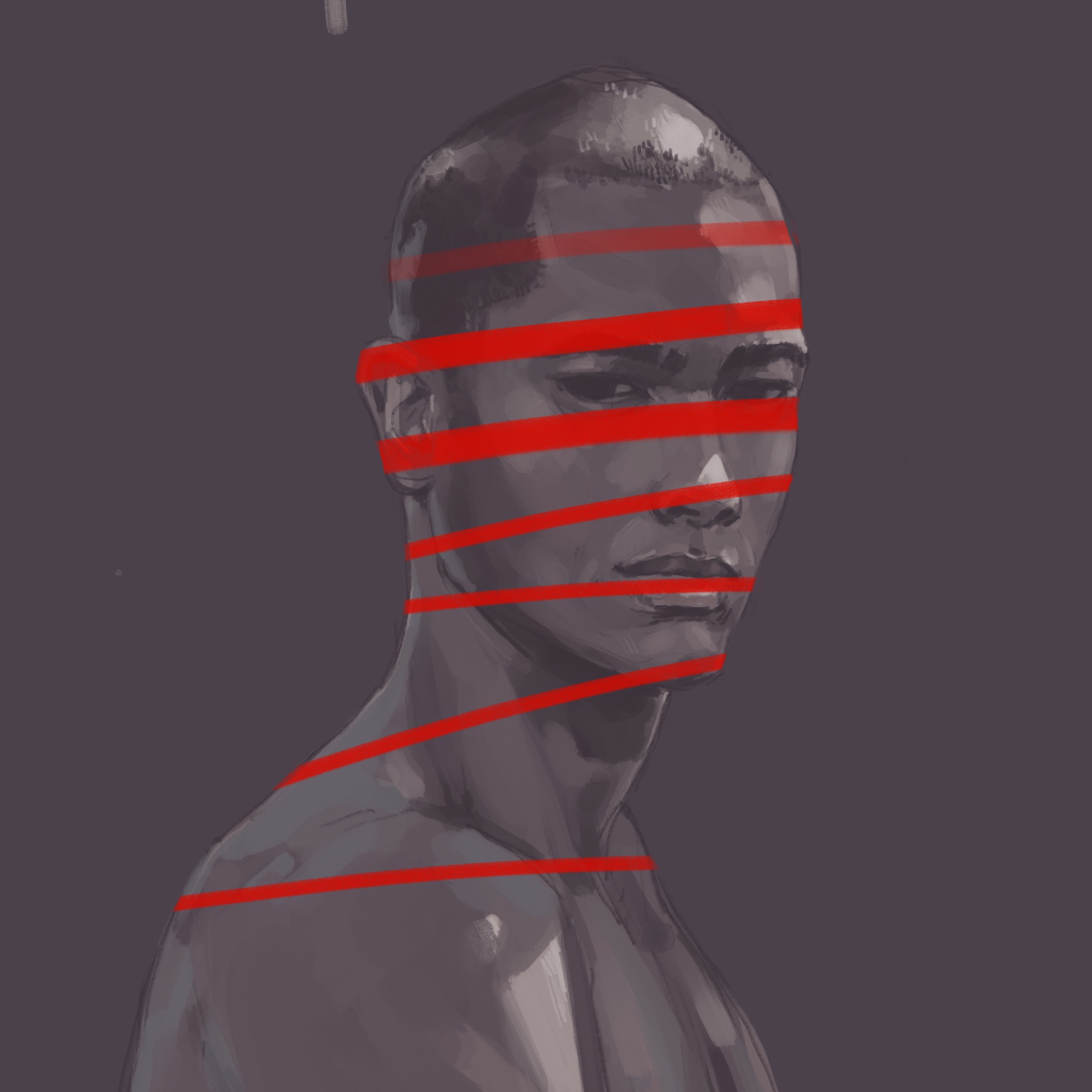
Alpha Mask
Setting a layer to Alpha Lock will allow you to paint just within the pixels in that layer. This can be incredibly useful if you’ve defined a shape such as a silhouette and then need to color it without losing outline.
You can do this by going to the layer menu, tapping on the layer you want to perform this on and selecting Alpha Lock from the menu.
Adding Noise
If you find that you want to break up the textures in your work and make your images look a little more organic, a great way of doing this is by adding a subtle noise layer. To achieve this, create a new layer and fill it with any color. Then hit the adjustments tab and from the drop-down menu select Noise. Setting it to 100% makes for a great ersatz paper texture.

Once you’ve done this, head to Hue, Saturation, Brightness from the same tab, and set the saturation to zero. Finally, head back to the adjustments tab one last time and select Recolour. Ideally, choose a darkish color from the piece you’re working on, then head over to the layer selector and set the noise layer to soft light. It’s also worth playing with the opacity slider at this point.
Pressure Curve
If you’re lucky enough to be using an Apple Pencil with an iPad Pro and feel like it’s not responsive enough, you can head over to adjust the pressure curve, allowing you to tweak the brushes so they behave better for you. To do this bring up the actions menu and select Prefs then hit Edit pressure curve and have a play about. It’s very simple to reset so don’t worry about messing anything up.
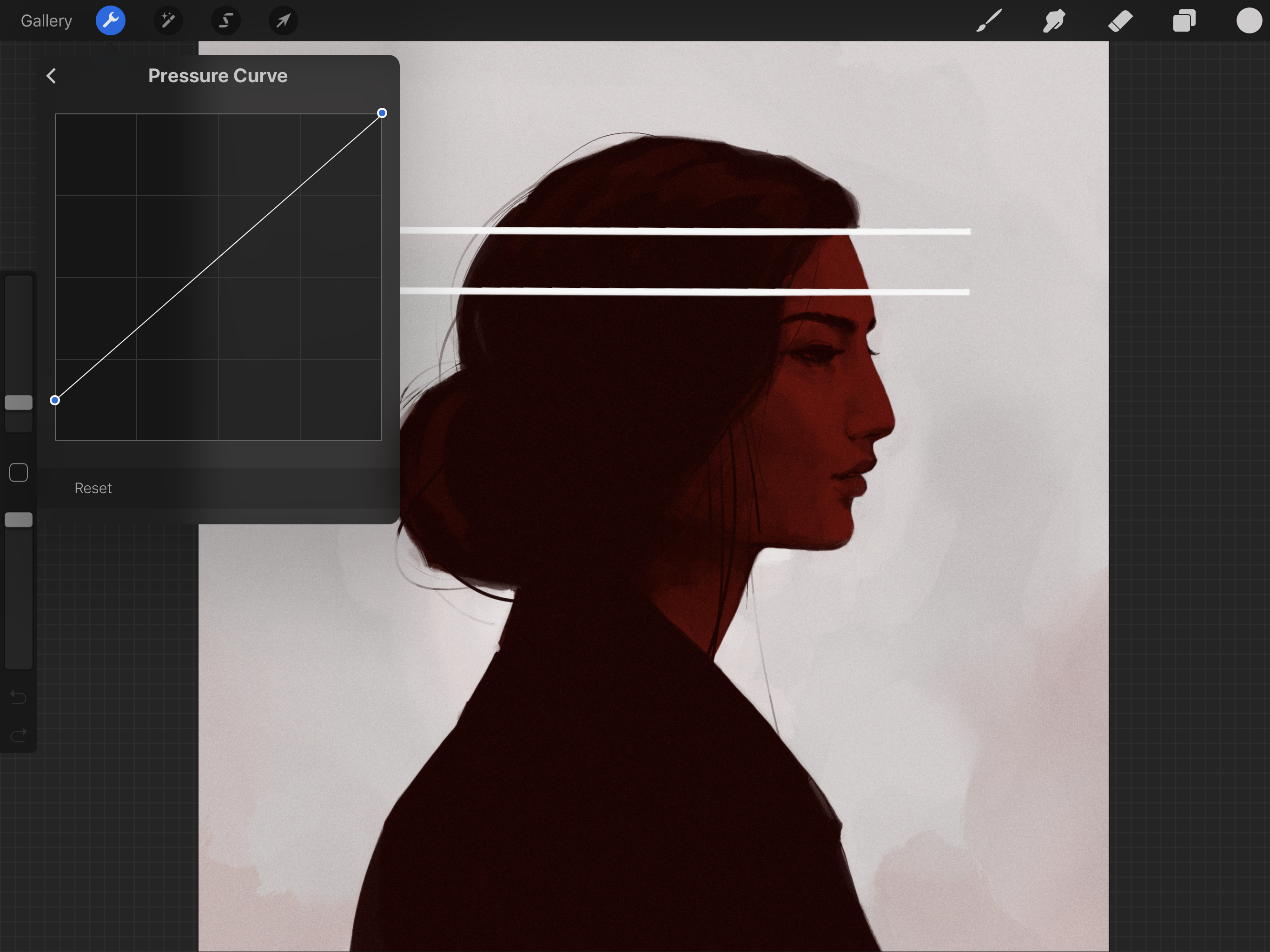
If you feel like you’re pressing too hard just bring the bottom dot up by a little bit. It may be helpful to compare this to the softness of a pencil: if the default is a standard writing pencil, then by moving the base pressure up you can make it feel more like a drawing pencil, or even charcoal.