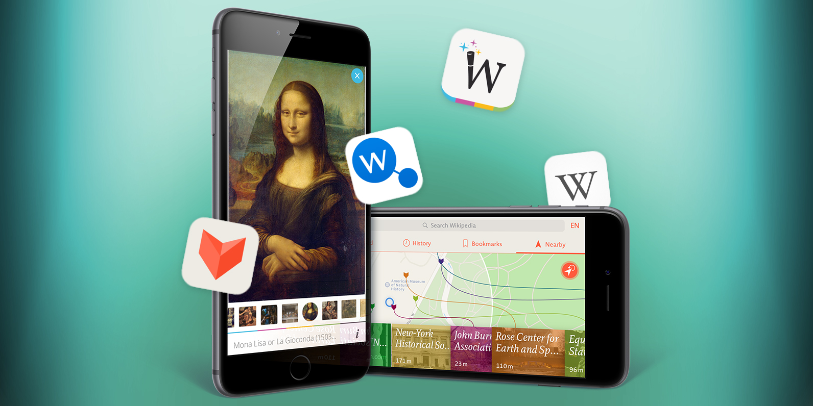

The finest apps for accessing the world’s biggest online encyclopaedia
Since its launch in 2001, Wikipedia has transformed the way in which people consume knowledge. The English-language version of the site now contains over five million articles, and is among the most popular websites in the world.
You can of course use Safari on your iPhone to browse this amazing pool of knowledge, but chances are you’d be better served using an app. Our selection looks at the very best available, each of which has unique features that boost your Wikipedia experience.
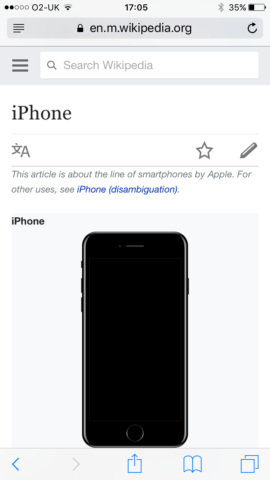
Wikipedia in Safari isn’t hugely usable nor inspiring
So whether you want snazzy design, clever diagrams that display the links between articles, location awareness, or just a really solid and modern Wikipedia experience, there’s an app here for you.
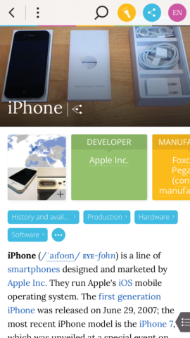
Wikipedia: best free Wikipedia app for iPhone
Free • v5.3.4 • 39.0 MB • By Wikimedia Foundation
Wikipedia’s own app might seem an obvious first port of call for people who want a better way to use the encyclopaedia on their iPhone. However, if you’ve used the app in the past, you might be in for a nice surprise. And this is because Wikipedia has evolved into a very smart iPhone app indeed.
The home screen, accessed using the Explore tab, is primarily a mix of featured articles, top reads, topical subjects based on the news, and algorithmically generated content determined by what you’ve previously read.

The home page provides a mix of articles to get you reading
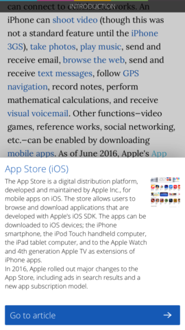
Additionally, this page is peppered with the odd random article you might find interesting, and location-oriented fare. It’s a great starting point for getting into the app, and a smartly conceived home page for regular users. Naturally, you can also search for something specific. Tap the magnifying glass and recent searches are shown. Start typing and filtered search results quickly appear.
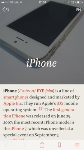
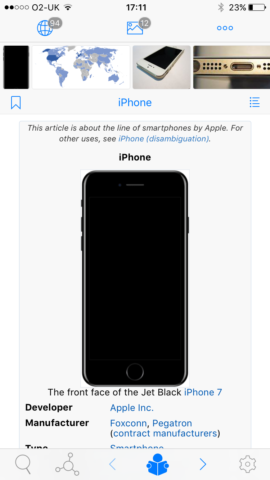
When inside an article, the advantages over Wikipedia in Safari become clear. The layout is superior, starting with a large image, headings, and thereafter quickly delving into the article’s main text. The table you often see on Wikipedia articles remains accessible, but is initially collapsed as a ‘quick facts’ link. The result feels somewhat magazine-like compared to the cruder mobile website take.
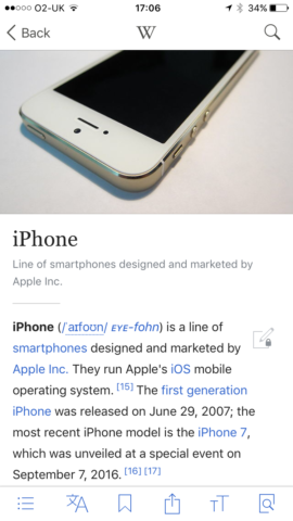
The Wikipedia app is a streamlined and smartly designed reader
Articles are also twinned with a bespoke tab bar, offering six buttons: table of contents; alternate languages; bookmarking; sharing; text size; and in-page search. Some might grumble there’s no way to remove these buttons and enter a more immersive full-screen mode, but the lightness of the overall design means that even with a toolbar at the top (navigation; Wikipedia logo; site-wide search) and this tab bar at the bottom, the app doesn’t feel cluttered.
For iPhone owners with a fairly recent device, the Wikipedia app makes excellent use of 3D Touch. The Quick Actions menu from pressing the app’s icon on your iPhone’s Home screen provides fast access to random and nearby articles, along with Wikipedia’s search. Better: when reading an article, you can use the Peek gesture to preview any link. Not keen? Just release your finger. Fancy reading it later? Swipe up and tap ‘Save for later’ (which isn’t just a bookmark, but also quietly stores the article for offline reading). Can’t wait? Press harder to ‘Pop’ and open the article immediately.
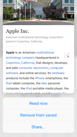
The app makes great use of Peek and Pop on newer iPhones
Quite often, first-party apps – especially free ones – disappoint. But Wikipedia ably covers all the bases, without costing you a penny. Hence why the remainder of our choices in this round-up are decidedly more niche in nature.
Wikiwand: best iPhone Wikipedia app for modern design
Free • v1.1 • 11.6 MB • By Wikiwand
Wikiwand started life as a browser extension. According to its creators, it “didn’t make sense [that] the fifth most popular website in the world, used by half a billion people, has an interface that hasn’t been updated in over a decade”. Reasoning that the site was cluttered, hard to read, hard to navigate, and lacking in terms of usability, the Wikiwand team set out to create something better.
The home page provides a mix of articles to get you reading
The desktop browser take on Wikiwand has a visual richness almost entirely absent from Wikipedia’s own website – and this follows through to the mobile app on the iPhone. The home page offers two routes to articles: a location button for those relating to nearby subjects, and a search bar, which as you type presents a filtered list of results. If you fancy a random article, you can get that by opening Wikiwand’s menu using the button at the top-left of the screen.
The display of articles is radically different from competing apps. You get a big picture across the top of the screen, followed by access to a gallery, and fact-table information shoved into a bunch of colorful boxes you can scroll with a flick. Major page sections appear as tappable blue lozenges, and a full table of contents is available using a button at the bottom-right of the screen. At the top of the screen, a large toolbar provides access to Wikipedia search, in-page search, sharing options, and a language selector.

Galleries are simple to browse in Wikiwand
The main problem with Wikiwand is that it doesn’t take enough advantage of your iPhone. There’s no landscape mode, you can’t store articles offline, and there aren’t even lists for saved articles and a search history. Annoyingly, some conventions are also omitted, such as swiping from the left of the screen to go back. There is at least a smart preview for tapped links, although we’d argue Wikipedia’s use of Peek/Pop is superior.
There’s no Peek and Pop here, but linked articles do have a preview
Still, Wikiwand is a free download, and despite its shortcomings is very much worth a look for anyone who fancies a Wikipedia app with a bit more visual punch than Wikipedia’s own.
V for Wikipedia: best premium Wikipedia app for iPhone
$4.99/£3.99 • v1.2.5 • 29.7 MB • By Raureif
Given that you can get perfectly decent Wikipedia apps for free, you might wonder why you should consider paying for one. In the case of V for Wikipedia (formerly Viki), it’s all about pushing craft and quality as far as possible, marrying the great typography found in real-world books with the smarts available in a digital interface.
V for Wikipedia is the most readable of the apps on test
The Home screen provides four options: a grid of most-read items to explore; your search history; bookmarked articles; and location-based search. Should you wish to look for anything specific, you can use the search bar at the top of the screen.
Regardless of the action you take, the result feels more handcrafted than in any of V’s contemporaries. The search provides the usual list, but adds a brief synopsis for each article. When reading an article, you enjoy a stylish layout, superb typography, and tables that actually fit within the confines of your iPhone’s display (rather than you having to scroll them horizontally).

Tables that fit within your iPhone screen – hurrah!
Location-based search is also interesting. Functionally, it’s little different from what you get elsewhere, displaying articles relevant to wherever you happen to be situated. But display-wise, it’s lovely, showing little colored flags on a map, with lines that lead to tappable blocks at the foot of the screen. Each block contains a title, a thumbnail image, and an indication of how far from you the place lies; and when the blocks are scrolled, so you can see more, the lines remain attached, stretching and bending accordingly.
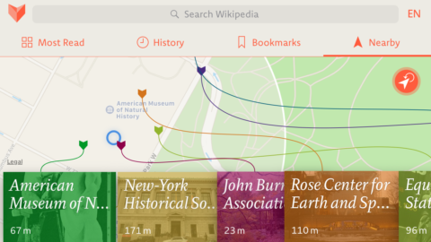
You probably won’t use it much, but V’s location search is lovely
Naturally, little of this is strictly necessary. But then again, neither is owning an iPhone, when you could easily enough make do with an Android handset. What sets V apart is that it’s just nicer to use than its contemporaries. It somehow feels like a combination of leafing through a musty old tome and utilising the power of an iPhone; and that, for us, makes it worth the outlay.
WikiLinks: best iPhone Wikipedia app for discovery
$5.99/£4.49 • v5.6 • 35.9 MB • By Boris Conforty
What sets Wikipedia apart from a traditional encyclopaedia is the way in which everything is linked. Every article is peppered with in-context links that direct you towards all manner of related information. It’s feasible to hurl yourself down a Wikipedia rabbit hole and not come up for hours, having gone on a merry journey from iPhone to multi-touch to Robert Moog to inventor to Leonardo da Vinci to staring at a list of the rulers of Milan and quietly wondering exactly how you got there.
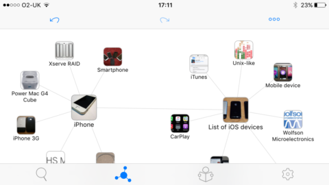
A mind-map in WikiLinks, showing connections between articles
For WikiLinks, the connections between articles are almost given as much prominence as the articles themselves. On performing a search and selecting a result, you aren’t immediately sent to an article, but instead peer at a map of icons. Your search term sits centrally, orbited by related content. Tap any of those icons and it moves away from its former parent before exploding its own set of satellites. Maps are automatically saved for later perusal, can be renamed, and also shared with other WikiLinks users. There’s a missed opportunity here to render out maps as flat visuals though.
The reader in WikiLinks feels a bit cluttered
Beyond all this mind-mapping malarky, you can of course read articles in WikiLinks. Tap any of the main elements within your map or use 3D touch on a satellite and then the read icon, and the app becomes a mite more conventional in appearance. It is, however, disappointingly weaker as a reader than the other apps in this round-up. Article sections begin life collapsed (maddening when you have many to open), the layout feels cluttered, and the typography isn’t particularly pleasing.
Fortunately, the last of those things can be amended in the settings, where you can choose alternate themes or fiddle around with specific options. Also, WikiLinks has a neat preview for linked articles, accessed by a long press or 3D Touch. In either case, the resulting box includes buttons to bookmark the article, read it, or use it to create a new map.
The preview window, where you can read something or make a new map
And it’s those maps that’ll keep you returning to WikiLinks. The main article reader probably isn’t enough to make WikiLinks your only Wikipedia app – or even the default – but the maps are great for research and making sense of the links between subject matter.