
The latest entry in our classic iPhone app series let you bring a touch of color back into a grayscale photographic world.

Color Splash 1.0.
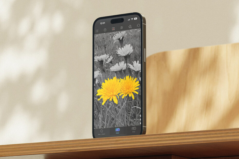
What was Color Splash?
A simple, focused photo editor based around selective color. It made your photo grayscale and let you paint original color back in with a fingertip.
Why was it a classic?
It helped you create a striking visual effect in a way that was approachable, and responsive enough that it felt magical. It had a quietly meditative feel too. Tracing color back into an image was both creative and calming.
Where is it now?
Still on the App Store and still being updated for modern devices. It’s a rare early App Store survivor that keeps doing what people always loved it for.
Get Color Splash ($2/£2) and Color Splash for iPad ($2/£2) from the App Store.

Color Splash in 2025.
Q&A: a brief history of Color Splash
We speak to Color Splash creator Hendrik Kueck about the birth of his app and the secret of its success.
What inspired you to create Color Splash?
Hendrik: After the iPhone SDK was released in 2008, I created an app called Juxtaposer because I was excited about the possibilities of direct photo manipulation using a multitouch interface. (It was also a fun way to procrastinate from my PhD.) The app was released on October 6, 2008, and allowed you to erase parts of a picture and move it around on top of a background image to create fun photomontages.
I was also a hobby photographer and early Flickr user, and became aware of the popularity of the ‘selective color’ effect, where only specific details of a photo were left in color. I realised I could create a new app focused on this effect by stacking a black and white version of a photo over the color original. Erasing the top image with your finger would then have the effect of ‘painting’ back colors into the black and white image.
Color Splash quickly arose from existing Juxtaposer code. While in Juxtaposer, you could freely move, scale, and rotate the top picture, in Color Splash the two images were kept aligned exactly. It took less than a day to make these changes and another week or two to polish Color Splash into a real new app for release.

An early version of Juxtaposer.
How was it to make an app in the iPhone’s early days?
Color Splash was released on February 15, 2009, and things were dramatically different from today. Because few new apps were released at the time, most got featured on the App Store front page automatically and would stay there for days, which was amazing for discovery.
From a development standpoint, things were technically challenging because the platform was so young and many convenient higher-level functions were missing. You had to work at a lower level. But I had a background in computer graphics and experience in OpenGL, a language used for programming GPUs (graphics processors).
When Apple announced the iPhone SDK in 2008, being able to develop apps with a multitouch interface was exciting, but I was also excited about the iPhone having a fairly powerful GPU that I’d be able to program using OpenGL. I thought that should make it possible to create a photo-editing app in which you could use a finger to directly interact with a photo, and have the image processing be so fast it would feel like your fingertip was magically changing the pixels beneath.

Brush options in Color Splash 1.0.
How did that interface impact the app?
The immediacy of pixels responding to your finger’s movements made all the difference. During development, I tried several technical approaches to achieve the effect of erasing an image using your finger. When I found one that worked and was fast – using some non-obvious OpenGL trickery – I was super excited. Your fingertip could directly manipulate the photo with no perceptible lag, making editing feel magical and intuitive.
This responsiveness became Color Splash’s key advantage. After it became successful, many copycat apps appeared, but in those apps you’d drag your finger across the photo and only a second later would the screen update. It felt so much worse. Fortunately for me, getting that instant response was technically quite difficult at the time, and so even though the interface was simple to copy, achieving the same performance took competitors a long time to figure out.
How did you find the right balance between power, features and immediacy?
Color Splash has always been a very simple, focused app. Even though I refined the user interface and added features like adjustment sliders over the years, I was never tempted to turn the app into a full-fledged general image editor. I see the simplicity and responsiveness as one of its main strengths and wouldn’t want to add more features and sacrifice that simplicity.

Color Splash in 2014, with adjustment sliders.
What have been the biggest high points of Color Splash?
No doubt the period right after its initial release. I’d had high hopes for Juxtaposer – there was nothing like it on the App Store at the time – and it was a powerful tool. However, it didn’t do nearly as well as I’d hoped. With Color Splash, though, I had no big expectations. But right after its launch, it took off like a rocket.
On day one, Color Splash hit the top 25 in the App Store. Then on the second day, Apple featured it prominently, which pushed it even higher. It reached number 2 in the US chart and stayed in the top 25 for a long time. But beyond the numbers, getting so many reviews from users who genuinely loved the app was what made it truly special.
What do you think drove the app’s success?
Its simplicity. I suspect many early users had never edited their photos before. Color Splash was easy and fun to use, and it was simple to understand what it did. It didn’t demand too much from users and made them feel empowered to have fun with their photos. It also helped that Color Splash was based on the same code as Juxtaposer, which gave it a solid foundation from day one, because I’d already fixed many bugs and refined the interface in the older app.

Hendrik’s app also made a splash on iPad.
What do you think is the secret to the app’s longevity?
Color Splash – and also Juxtaposer – are among a small number of apps released in the very early days of the App Store that are still working and being supported today. I’m planning to keep that going as long as I can, and I know users appreciate it.
I love hearing from people who’ve regularly used one of my apps for many years. Being apps that are paid up-front definitely makes them relics from the past in today’s ecosystem, though. The subscription model has won and is more sustainable, but I’ve decided to stick with one-time purchases for these apps, even though I’m certain I could have made more money by switching.