

A streamlined audio player for iPhone that was music to our ears
The latest entry in our classic app series came across like Apple had continued to develop its original Music app, rather than becoming obsessed with streaming.
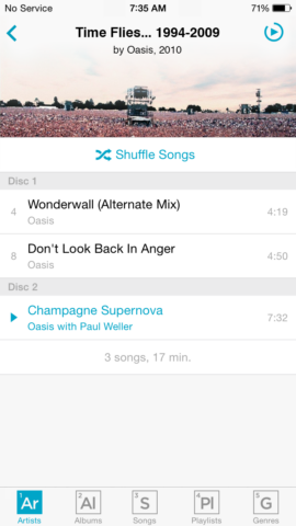
The original player, complete with ‘element’ toolbar buttons.
What was Cs Music Pro?
On launch in 2014, it was actually called Cesium (an anagram for eMusic). And it was a music player that in many ways felt like a modern implementation of Apple’s original Music app – a sweet spot for many music fans.
Why was it a classic?
Cesium prioritized your library, not streaming trends. When Apple Music launched, Cesium helped you focus by providing optional access to your Apple Music library alongside locally stored files, but omitting distractions like ‘For You’. And the minimal interface with flexible custom views got you to your music – fast.
Where is it now?
The app had a name change to Cs (after the chemical abbreviation), due to a legal threat. And it’s had changes to its feature set too. But it’s still a going concern – and one that remains true to its original principles and philosophy.
Get Cs Music Pro ($2.99/£2.99) from the App Store.

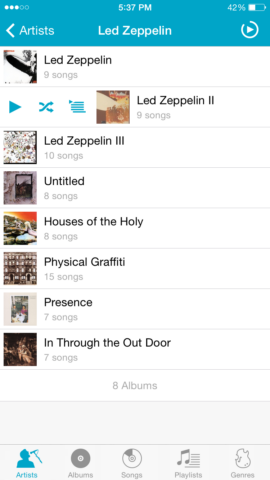
Cs Music Pro in 2024, in all its sleek minimalist glory.
Q&A: a brief history of Cs Music Pro
We speak to Cs creator Mike Clay about the secret to making a successful music app.
Where did your love of music come from?
From the moment I got my first Walkman, the headphones stayed on. And I’ve always been a completist – I’d find a new band and want to collect everything they released. I had a huge CD wallet, painstakingly stored with each booklet next to the disc, that I took everywhere.
My first iPod – a 4th-gen – put that bulky binder out of business. But the bigger revelation was iTunes. By then, I’d got into live concert recordings and spent hours tagging my library to separate and sort official and unofficial recordings. It was… obsessive.
What was the genesis of your music player app?
The honest truth? I had a lot invested in the Artists List > Albums List > Album Songs flow In Apple’s app. But after an update, it suddenly showed an artist’s songs in a big list, grouped by album and – worst of all – in reverse chronological order.
Apparently back then I had enough free time to devote a lot of energy to this problem! I tried other apps – but this was the early days of iOS 7 and they lacked visual polish. As a graphic designer, I thought: “I’ve coded a website and could figure out how to make an app that does what I want and feels like part of the ecosystem.” That turned out to be a lot harder than I imagined!
From its earliest days, Mike’s app had a minimalist vibe.
What were the guiding principles when working on the first version of the app?
I wanted a user-experience that felt iOS-native and supported those sorting details. Both of those things helped my app stand out. It felt more Apple-like than the competition. And people at the time felt protective of their music collections and resistant to change. There was a substantial group looking for ‘the old Music app’ – Cesium was a good option for them.
How do you think your minimal aesthetic benefitted your app?
My day job is developing wayfinding systems for complex environments like hospitals and airports. In a high-stress situation, you need to ensure that at each decision point people receive only immediately relevant information to help them make the right choice and move on. A music player is much lower stakes, but drawing on similar principles removes clutter.

Cs has bucked modern design trends regarding white space.
At its core, my app is mainly about navigation. A simple interface also helps keep information density high. App trends have shifted to larger graphics and white space as screens have become larger, but there’s value in a music player fitting more items on the screen.
How do you balance minimalism and new features?
My initial goal was to keep adding new functionality, but that eventually shifted to emphasizing stability and reliability. I’m very aware my app’s success rests on access to the system player Apple opened up for third-party developers. That’s awesome, but has limitations. And while it’s tempting to expand on what’s explicitly supported, that can create problems.
For example, Apple lets developers add songs to the playback queue but not fetch nor interact with songs that are in it. For a long time, I worked on ways to support that, but it never worked 100%. Ultimately, I decided it’s better for the user experience to focus strictly on what can be delivered perfectly – or nearly so.
Swiping to access controls arrived in Mike’s app before Apple Music.
Can you share any highlights regarding favorite features or experiences while working on your app?
I’m proud of features that appeared in Cs before being adopted into Apple’s app, such as swiping songs to access queue controls and pinning list items. My favorite change was dynamically coloring the Now Playing view based on album artwork.
The app also brought me an exciting opportunity: interviewing with the Apple Music team in Cupertino! I’m entirely self-taught, so it was unsurprising it didn’t work out. But it was a great experience to visit the Apple campus and meet engineers who work on Apple Music every day.
What do you think the secret is to your app’s longevity?
I’m confident the secret has been subtle refinement, rather than reinvention. And I say that because when I try to dramatically overhaul something, I get a flood of complaints! But I don’t think it’s that my users are old-fashioned – I hear from people with a range of needs and use cases who appreciate the app for different reasons. So I think it’s a testament to the strength of that original Apple design.