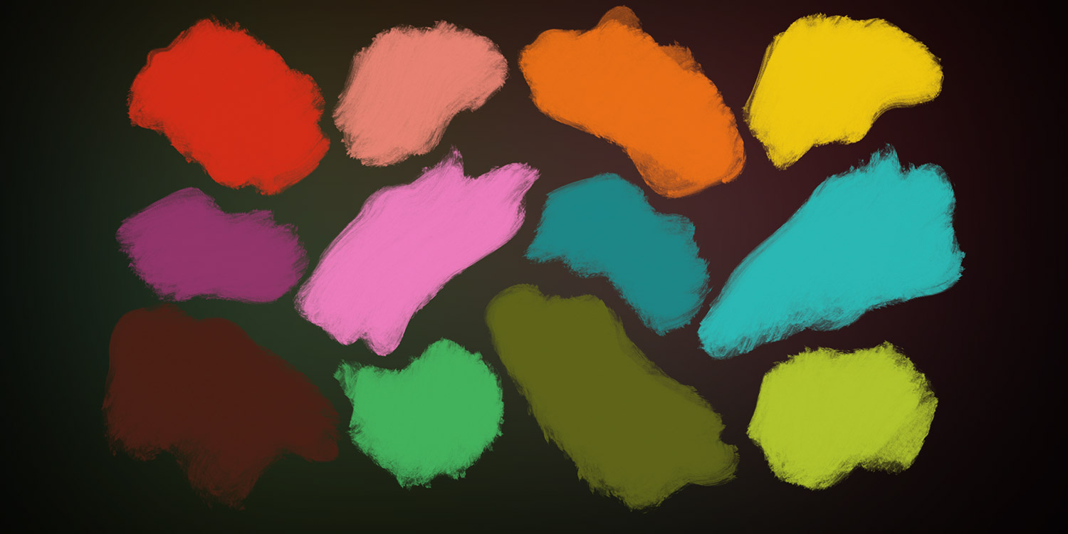
Tips and iPhone apps to help you pick the right color, every time
Color can be a minefield for the uninitiated, but it’s the cornerstone of visual art and design. This is true whether you’re working on a digital painting, a design document, decorating a home, or creatively applying filters to photographs.
Science, trends and good taste all impact on color in different ways, and this feature aims to give you a guiding hand. Armed with tips – and top-notch iPhone apps – it will help you better understand the basics of color and what it can do for you.
Understand color theory
To grasp how to work with color, learn color theory basics. Start with a traditional color wheel, which alternates primary colors (those that can’t be mixed from others – red, yellow and blue), secondary colors (a mix of two primaries), and tertiary (a mix of primaries and secondaries).
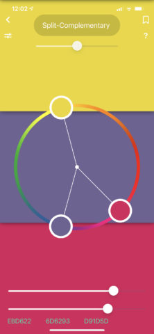
On iPhone, explore this system with the suitably named Color Wheel ($2/£2). Complementary colors – those on the opposite sides of the wheel, provide impact – something used to great effect by Pointillist painters. But overuse can be garish.
Split complementary uses a hue and two colors adjacent to its complimentary – which gives you contrast, but with less tension. Analogous schemes that use adjacent colors can be harmonious but bland. Consider adding a complimentary color for added punch.
Play with color
Rules are fine, but experimentation is vital when working with color. Pocket Palette (free) offers a great way to mess around with color on your iPhone, potentially creating interesting combinations along the way.
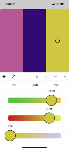
Tap the + button to create a new palette, and then the pencil and Edit Palette. Next, tap RGB to access sliders that let you adjust the color of a selected color swatch. You can add more with the + button, and save palettes to later share as color values or images.
While using Pocket Palette, create palettes that utilize color wheel rules – and then break them and see what happens. See how warm colors attract attention while cooler ones melt into the background. Recognize how colors play off each other – green feels warm when adjacent to blue, but not when next to yellow. Note how palettes feel more harmonious when similar saturation levels are used throughout.
Be inspired by the world
If you feel intimidated working up a palette from nothing, look to the real world as a starting point. Many apps allow you to use your camera or photos to create palettes. Adobe Capture (free) does this particularly well.
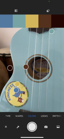
When using the Colors option and your camera, five dots playfully bounce around, attempting to lock on to key colors. Tap the screen and the picture freezes, so you can manually adjust the dots. Alternatively, you can work with an existing static image. Palettes can be saved (along with their originating image) and exported.
What you’ll often find is even mundane imagery produces interesting color combinations you’d not previously thought of. Also, the app limits you to five colors, which might seem restrictive – but keeping things simple is smart for design work and even for digital painting. To recreate a scene in paint, it’s best to begin with the most important colors, rather than a massive selection that’d make a real-world wooden palette spontaneously combust out of sheer terror.
Organize your palettes
If you fancy paying for a palettes app, Pastel (free or $5/£5) also enables you to draw colors from existing photos – and in a way that quickly lets you add further hues to the ones it picks out. The main reason to buy the app, though, is to store and manage your palettes.
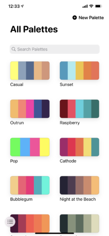
You get a hint of this with the free version, which allows you to use the built-in library and add up to 20 new items. But pay a fiver and that limitation is removed. The interface is gorgeous, enabling you to quickly filter your palettes, edit them, view them full-screen, copy their values (via a long press), or export them in a range of formats.
The notion of palette re-use might seem odd, but it ensures consistency for design work. You might use combinations multiple times elsewhere as well, for example if you create a color set that works as a base for landscape paintings or when refurbishing your home.
So start with tried and tested rules, mix in your own intuition and experimentation, and you should be able to bring more color to your world – in a way that truly satisfies.
