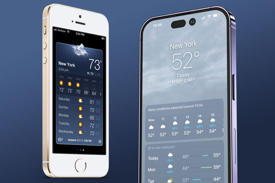

When an iPhone 15 Pro Max screen sometimes shows no more than an iPhone 5, that suggests design priorities should change
I have an original iPod touch in a drawer. The battery’s dead to the extent the device barely lasts seconds away from a charger before abruptly switching off. But on occasion, I have fired the device up to marvel at how things used to be.
Mostly, I’m struck by how small the device is. I wonder: how did anyone manage to do anything on these tiny displays? But many of us did, because the first five generations of iPhone were roughly the same size. It was with the iPhone 5 (which, confusingly, was the sixth-gen iPhone) that things started to change, with a taller screen. Then the iPhones 6 changed things forever, ushering in surfboard-sized phones that we’ve had ever since.
The assumption is we want bigger displays because they make using devices easier and show us more content. But that’s just the theory – it isn’t always reality.
Sure, when it comes to scrolling lists, you can see far more on a modern iPhone than one from 2007. You’ll see more emails in your inbox, or more items in a to-do list.
-
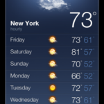
- iPhone 4 Weather app.
-
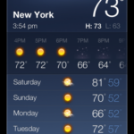
- iPhone 5 Weather app
-
- iPhone 15 Pro Max Weather app.
iPhone 4/5 Weather app images credit: iDownloadBlog.
However, a post from Grumpy Website compares an iPhone 5 running the Apple Weather app from its era and a more modern incarnation on an iPhone from last year. The comment asks: “Screen: twice as big. Information: 1/4 of original. Is this progress?”
Weathering the storm
My initial thought was: Is this a fair comparison? When you look the default state of the Weather app, on the 320x480px display of the original iPhones, you got the current conditions at the top, and a six-day forecast below. The slightly taller display of the iPhone 5 – 320x568px – allowed you to also see five upcoming hourly predictions above the daily forecast.
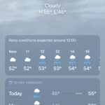
On the current iPhone 15 Pro Max, with its equivalent logical width/height of 430×932, you don’t usually see what’s in the Grumpy Website grab, which adds context-sensitive alerts above the forecast. What you’d typically see is a written overview, up to seven hourly predictions (sometimes integrating sunrise/sunset times) and up to five daily forecasts, depending on the length of the written overview.
Grumpy Website exists to flag poor user-interface design and would argue alerts should not fill the display to the degree shown in its example. And things can be even worse – see the depicted Acharacale example below. But what’s surprising is even without these alerts, the largest iPhone display today shows barely more information than an iPhone released a decade ago.
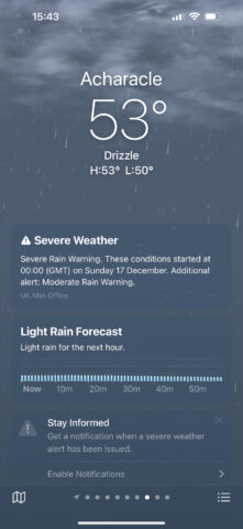
Weather alerts sometimes push all forecasts off the screen.
For Apple, this must be a deliberate design decision. It doesn’t want to flood you with information and wants to draw your eye to what’s most important right now. Even the alerts play into that, forcing you to take in storm warnings before scrolling down to peruse how things might play out over the coming week. Even so, it feels curious that people’s reasoning for larger displays is to see more at once, and yet that’s not always what they get.
Testing the limits
This isn’t just a Weather thing. As displays increased in size, many other designers reduced the density of provided on-screen information. Whereas once you had very limited screen space and had to be ruthless about what you included or omitted, that’s now more of a choice. And designers often choose dispersed content over immediacy. This brings its own problems, forcing people to scroll. That can make it hard to focus on an idea presented over several scrolling screens when it could fit in one.
Worse, these design ideas have made their way to much larger displays. We now often see iPhone-first design on iPad or even desktop displays. Websites that look like blown-up iPhone apps on an iMac look absurd. Moreover, they point to designers prizing the notion of one-size-fits-all, rather than optimizing for each display.
Even for iPhone, one-size-fits-all disappeared long ago, with the iPhone 5. And I’d like to see a design shift that recognizes these larger displays. I still don’t want to be deluged with information, to the degree an app packs every pixel and doesn’t let content breathe. But from Weather to websites and beyond, modern layouts on larger phones could sometimes do with showing a little more information rather than a little less.