
Need to get things done? Then you need to get Things installed
This latest entry in our classic apps series explores a to-do manager. And now this article is live, we can check an entry off our own to-do list. Hooray!
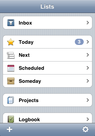
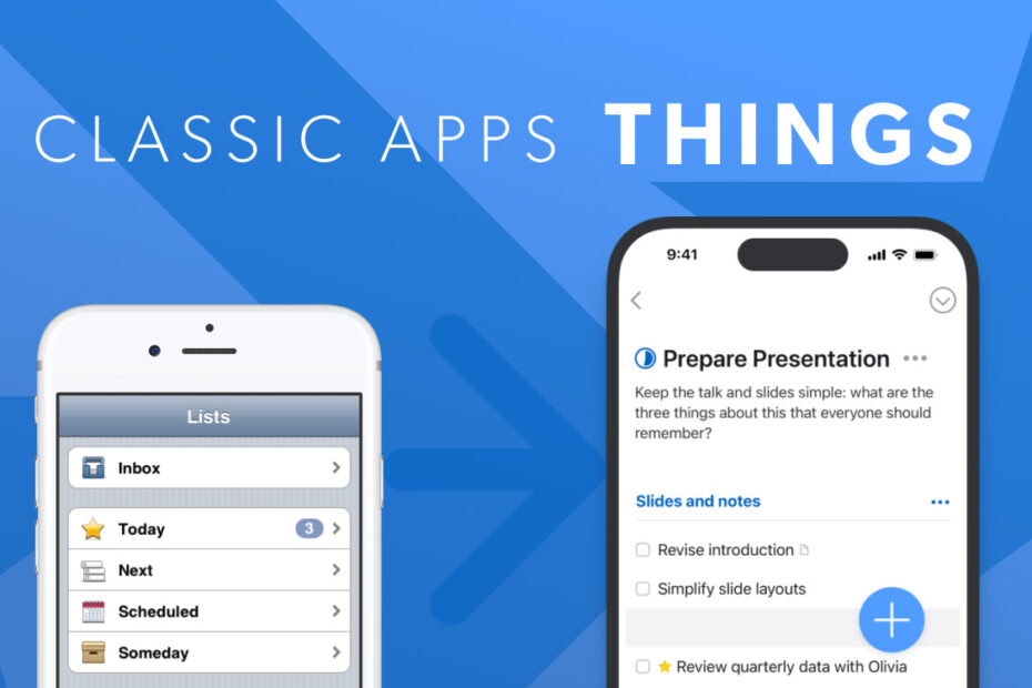
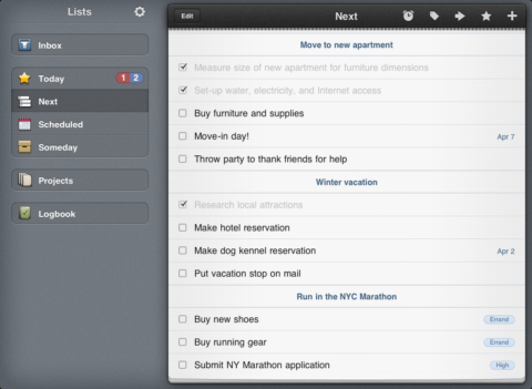
Things in 2009
What was Things?
A to-do manager broadly based on Getting Things Done (GTD) methodology. It invited you to dump your to-dos into an inbox and then organize them into projects and assign them times. You could then better prioritize tasks that were urgent over those that were merely imminent, and blithely ignore to-dos that could in theory be done whenever you pleased.
Why was it a classic?
The underlying structure proved effective if you went all-in. And the app’s premium nature ensured it was regularly updated, which meant features were added and refined over time. Things also felt like it was made with care. Many to-do managers had interfaces even a parent would struggle to love; but with Things, you wished all apps were made its way.
Where is it now?
Now in its third major incarnation, Things remains available to buy, with a swish new interface that combines minimalism and playfulness, and plenty of features to help you hit your goals.
Visit the Things website or get Things 3 ($9.99/£9.99) or Things 3 for iPad ($19.99/£19.99) from the App Store.
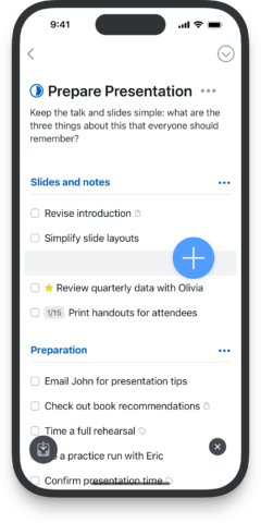
Things for the current iPhone
Q&A: a brief history of Things
We speak to Cultured Code chief marketing officer Mick Payne about the creation and ongoing success of Things.
Why did you make a to-do app?
Mick: 16 years ago, when we released the first Things alpha version, there was no App Store, nor the number of productivity tools we have today. But our lives were becoming increasingly digital, and we wanted to make a tool to manage it all, because there wasn’t a good way to. And we weren’t the only ones who needed such a tool, so there was an emerging market for one.
What set Things apart from the competition?
We’ve always been careful with our design and mindful of the need to keep it as simple as possible. When you open Things, you should feel relaxed and in control, not stressed out. If there’s too much going on in an app’s interface, it’s easy to feel overwhelmed.
And design is more than visual. We pay a lot of attention to how features will be used to manage your life. If someone sat in on our discussions, they might be amazed at how much time and thought goes into every decision — even small ones! Perhaps it’s that perfectionist obsession that sets Things apart.
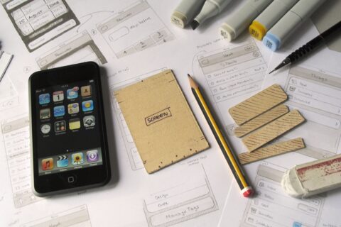
Early work sketching out Things for iPhone
How early in the process of the creation of Things were you aware of the iPhone?
We were building Things for Mac before the iPhone was announced, and it took a further 18 months before the App Store arrived. But once it became clear we could make Things for iPhone, we immediately began working on it.
It was an interesting, fun challenge to reimagine the interface for the smaller device. It also introduced the problem of sync, which would lead us to build our own cloud service. So you could say the iPhone transformed the development of Things.
How important was it to be a day-one App Store app?
We knew the App Store would be a big deal, and wanted to make sure Things would be ready. We were also ready on day one for iPad and Apple Watch. It’s important your users can enjoy your app on their new device as soon as they can.
Things for iPad, circa 2010
What are the most important ways Things evolved over the years?
The most noticeable change has been its appearance. Most early iPhone/iPad apps were skeuomorphic, and we had an iPad view where your projects were presented as cute little booklets. When you tapped one, it animated as if you were opening a book.
Over the years, and particularly due to iOS 7, interface styles became ‘flatter’ and less fanciful. By the time we got to Things 3, our goal was to make the app appear, as much as possible, like a simple white sheet of paper, to place the emphasis on your content.
Why do you think Things stood the test of time?
It’s the only product we make, and so we’ve been able to focus on it over the years. We love working on it, and it’s continued to sell well, and so it’s natural to keep going.
We’ve also continued to bring new features to Things. The addition of Markdown is one of my favorites. This makes it possible to structure notes and add more visual style, which has led to me writing more inside Things than I did before.
I also love the app’s widgets. I use one to show my deadlines, so I never overlook anything important, and another to instantly create a new to-do with a tap. It’s super convenient.
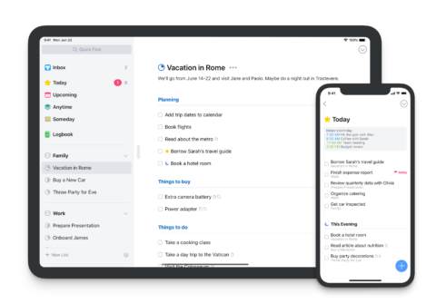
Things on a modern iPhone and iPad.
All images in this article courtesy of Cultured Code.