
Dimension. Distance. Physicality. Is it game over for flat design?
The early days of iPhone and iPad were all about interfaces with inherent playfulness. The conceit was that these devices ‘became’ other objects whenever an app was launched– and Apple’s designers went all-in on skeuomorphism, having interface elements retain design cues from their real-world equivalents.
The benefits of this approach were immediacy and familiarity with devices that were new and unlike anything we’d ever seen before. Had Apple presented an iPhone or an iPad with a space-age interface, it could have repelled the typical user. But textures and buttons were familiar fare.
It might look twee, but at least the buttons looked like buttons
With iOS 7, everything changed. Apple’s then design chief Jony Ive eradicated texture. iPhone and iPad interfaces became an exercise in minimalism. To some degree, that looked smart – and it’s arguable Apple’s prior obsession with texture had sometimes gone too far.
But iOS 7 not only robbed Apple devices of visual interest; it also removed key affordances, making it harder for average users to tell which things on the screen could be interacted with.
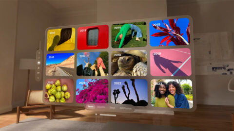
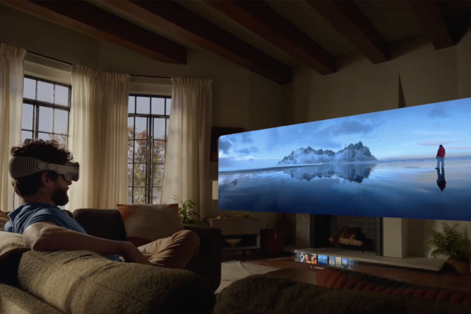
The Vision Pro UI is glassy and glossy – but it has depth and subtle texture
Apple Vision Pro appears to be a balancing act between these two extremes. At WWDC23, an Apple exec enthused about how every element of the interface had been crafted to have a sense of physicality. They have dimension and depth, helping you understand scale and distance. The aim is to make people feel comfortable through natural interactions – as if they are moving real objects.
Arguably, no-one needs to again see leather stitching on Calendar, felt textures in Game Center, or bits of torn paper in Notes. But as Apple merges the virtual and the real in Vision Pro, it would be good to bring a little more of the ‘real’ back to iOS and iPadOS.