
Lucky number 7 – unless you like your edges flat
Apple can’t stop releasing new hardware, and Apple Watch Series 7 hits the stores on October 15. ‘Full screen ahead,’ jokes Apple’s marketing. But Apple’s detractors complain that the revised device doesn’t have an edge – and they mean that literally.
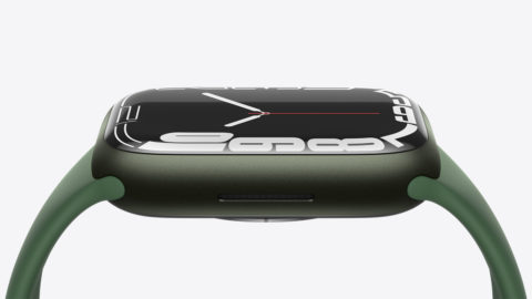
To add context to that last point, the long-standing rumor was that the new Apple Watch would follow iPad and iPhone in embracing Apple’s new flat-edged design language. All the rumor sites said so, and so it must have been true. But it wasn’t. In what amounted to a smart decision on Apple’s part that coincidentally doubled up as epic trolling, Apple’s latest design was instead the roundest and curviest Apple Watch yet.
Certain folks started fuming instantly. Why had Apple taken their flat-edged beauty (that had only existed in their minds) away? Why was Apple releasing a curvy watch, rather than making all its products look broadly the same?
Organic produce
A moment’s thought would lead you to an obvious conclusion: flat-edged watches of the thickness required by a wrist-based computer are hardly all the rage and can look dated. Apple’s more organic design language is more appropriate for the wrist. But most importantly, it showcases that Apple’s updates concentrate on what matters, not the whims of the rumor mill.
When you dig into Apple’s commentary on the Series 7, it barely mentions the new design at all, bar noting that the subtle wrap-around effect provides seamless integration with the case. (This is good, making Apple Watch look less like someone glued a piece of glass to the top of a metal frame.)
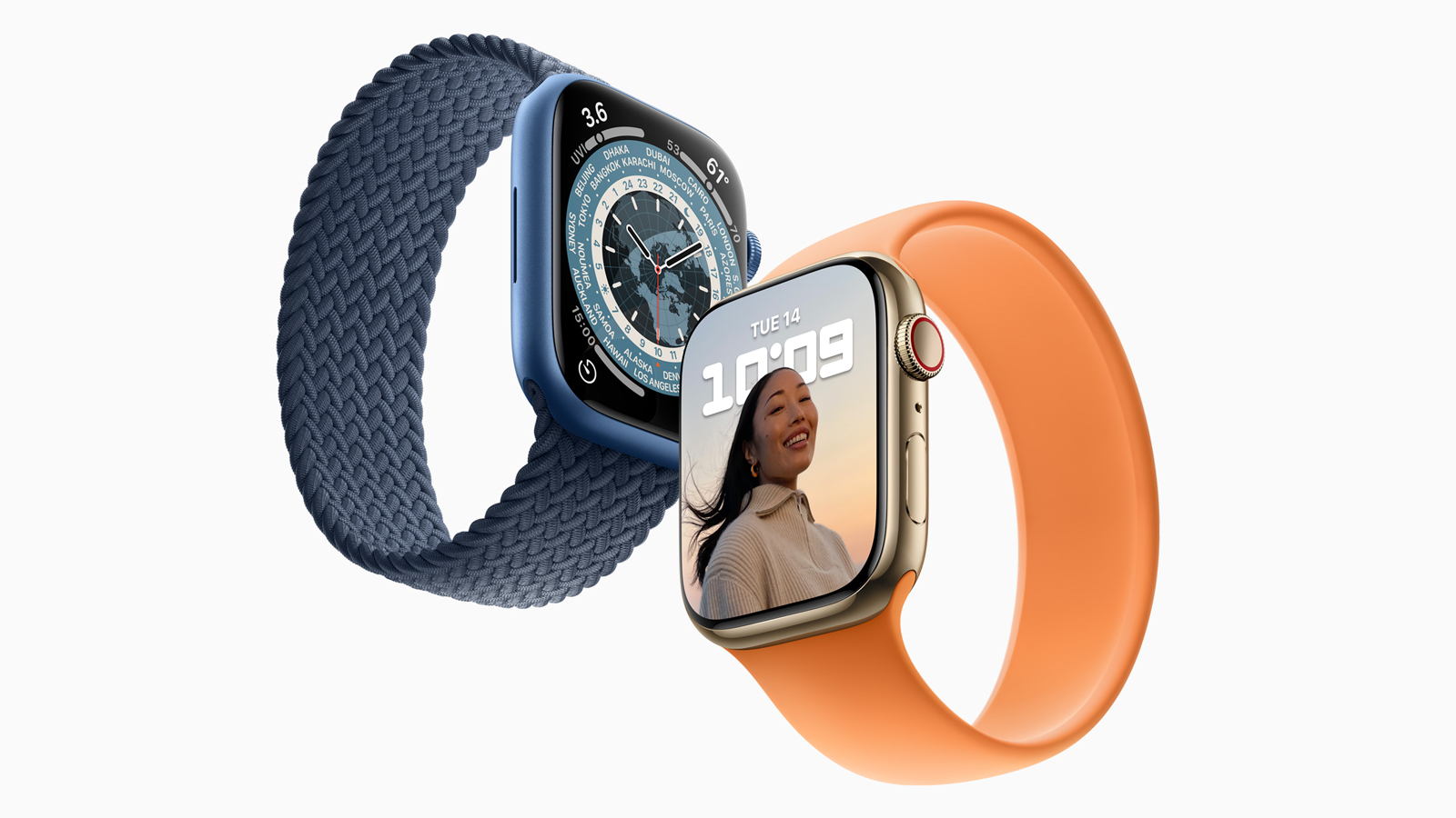
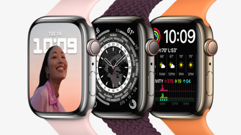
What’s more telling is what Apple wants to talk about at length. There’s a larger display that gives you 20% more screen space than this wearable’s predecessor – and a whopping 50% more than on the aging Series 3. That means you see more on the screen without scrolling and has enabled Apple to increase button sizes and introduce a swipe-based keyboard.
Beyond that, the always-on screen mode is 70% brighter indoors, increasing battery life and decreasing how often you need to interact with your Apple Watch to get at important information.
Juiced up
There are other changes too. This Apple Watch is more durable when it comes to knocks and dust. It charges far more quickly than the Series 6, going from empty to 80% charged in 45 minutes, and a mere eight minutes on a charger provides enough juice to get the thing through eight hours of sleep tracking.
Many of these changes are admittedly subtle. But they meaningfully improve the user experience. And it’s in that area you might argue Apple could have made further changes. For example, the honeycomb apps grid is a mess and nightmarish to organize, while the scrollable list view that starts off efficient is less so when you’ve loads of apps installed.
Where things go wrong is in people – especially some aspects of the tech press – having an ongoing infatuation with mass upheaval. Just because a product doesn’t look radically different from its predecessor, that doesn’t mean it’s a design failure. What’s important is making changes that matter, not those that are little more than skin deep.