
It may be several months until Apple shows off iOS 14 at WWDC in June, but that hasn’t stopped the rumor mill searching for clues as to what we might expect from the upcoming release. Already there have been reports of Apple loosening its grip on default apps, allowing users to choose third-party alternatives to Safari, Mail, and more – and now an alleged video leak shows how iOS 14 will change up the iconic App Switcher interface.
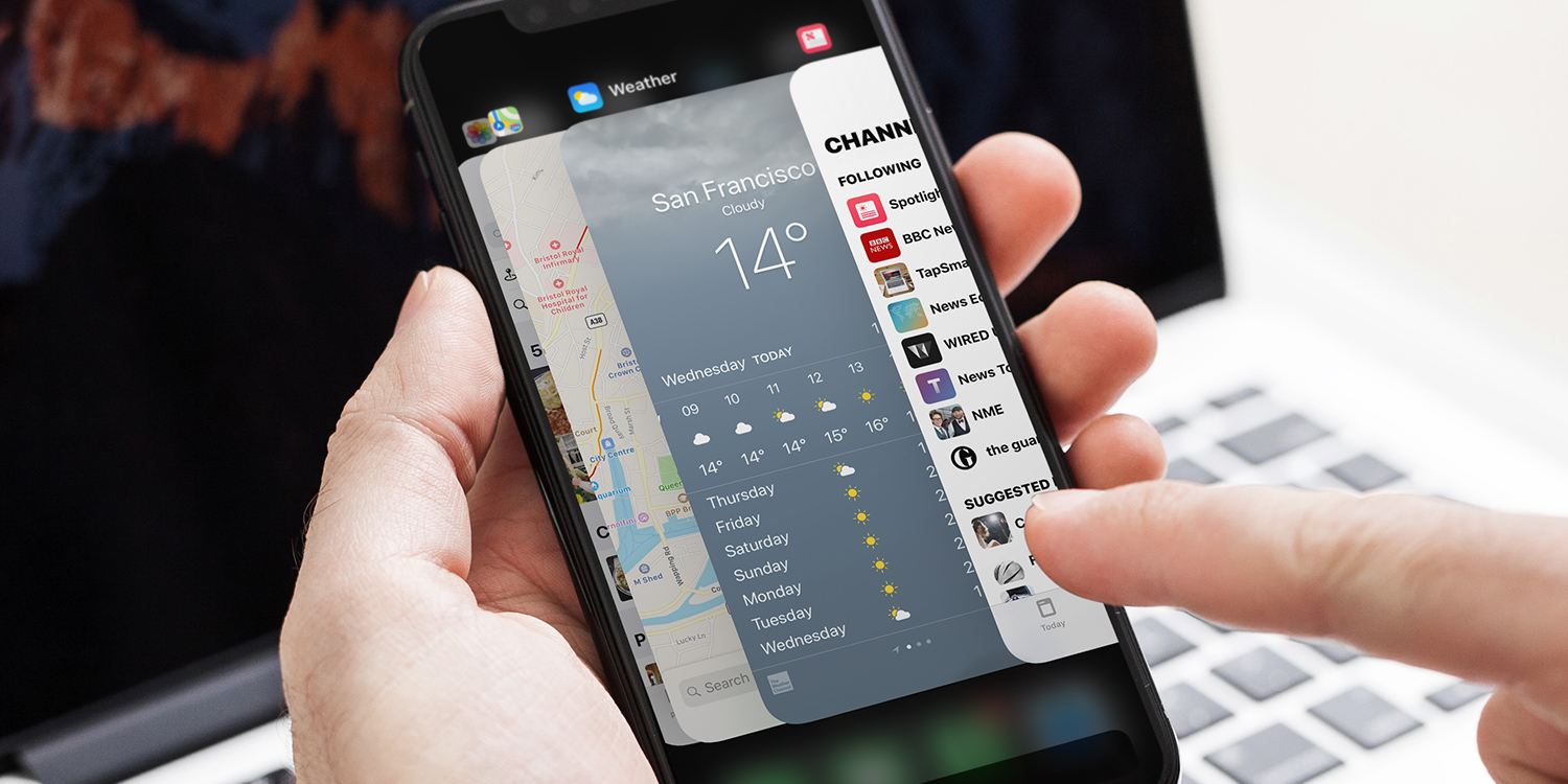
This feature, also known as the Recent Apps view, is at the core of multitasking on iOS. It allows users to quickly switch between apps, using a chronological timeline of everything you’ve recently used. You can reach the App Switcher by swiping up from the bottom of the screen and pausing momentarily – or, on older devices, with a double-click of the Home button.
Apple first used this overlapping carousel-style design in its “Cover Flow” interface for browsing albums in iTunes. In the following years, similar designs made their way to many aspects of iOS and macOS. For the most part, Apple has since ditched this kind of interface in favor of flatter, more minimal designs. This trend away from “skeuomorphism” has been in action ever since iOS 7 – but the App Switcher has endured as one of the few remaining examples of an overlapping interface with depth and shadow, reminiscent of a deck of cards.
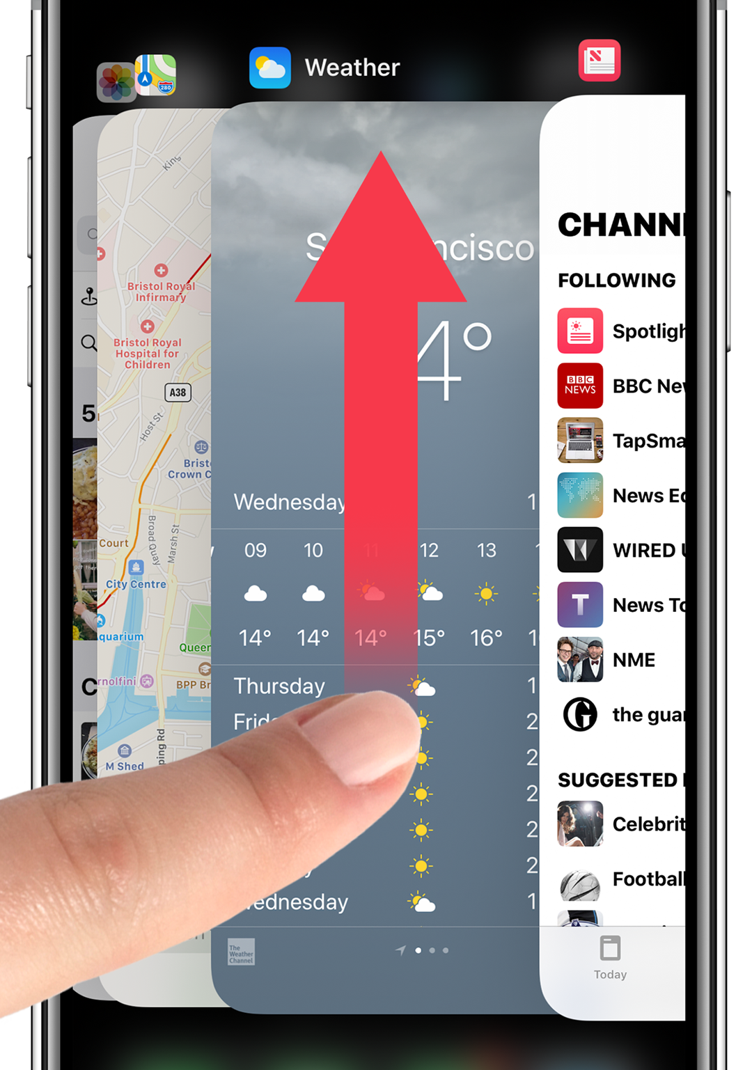
If this leak is correct, it’s soon going the way of the dodo, replaced by the grid-like design already in use on the iPad.
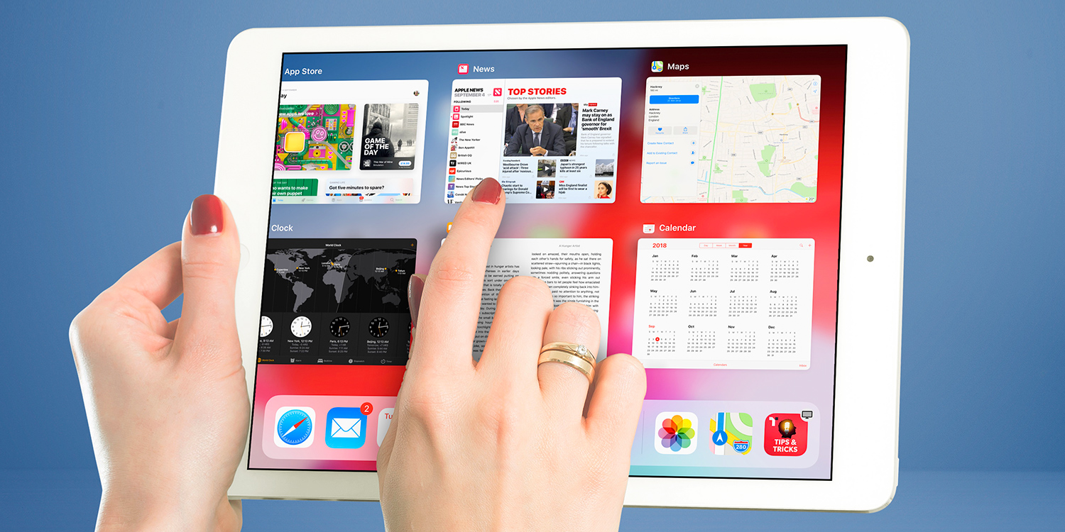
The current App Switcher on iPad
The grid-style makes perfect sense on the large display of an iPad, but could arguably end up a little cramped on an iPhone. However, there’s no denying it’s a more efficient design, presenting a clear view of four recent apps at once. Users would still be able to “force quit” paused apps with a quick swipe up. Here’s what the redesign would look like, courtesy 91Mobiles.
Do you like this more or less than the old style?
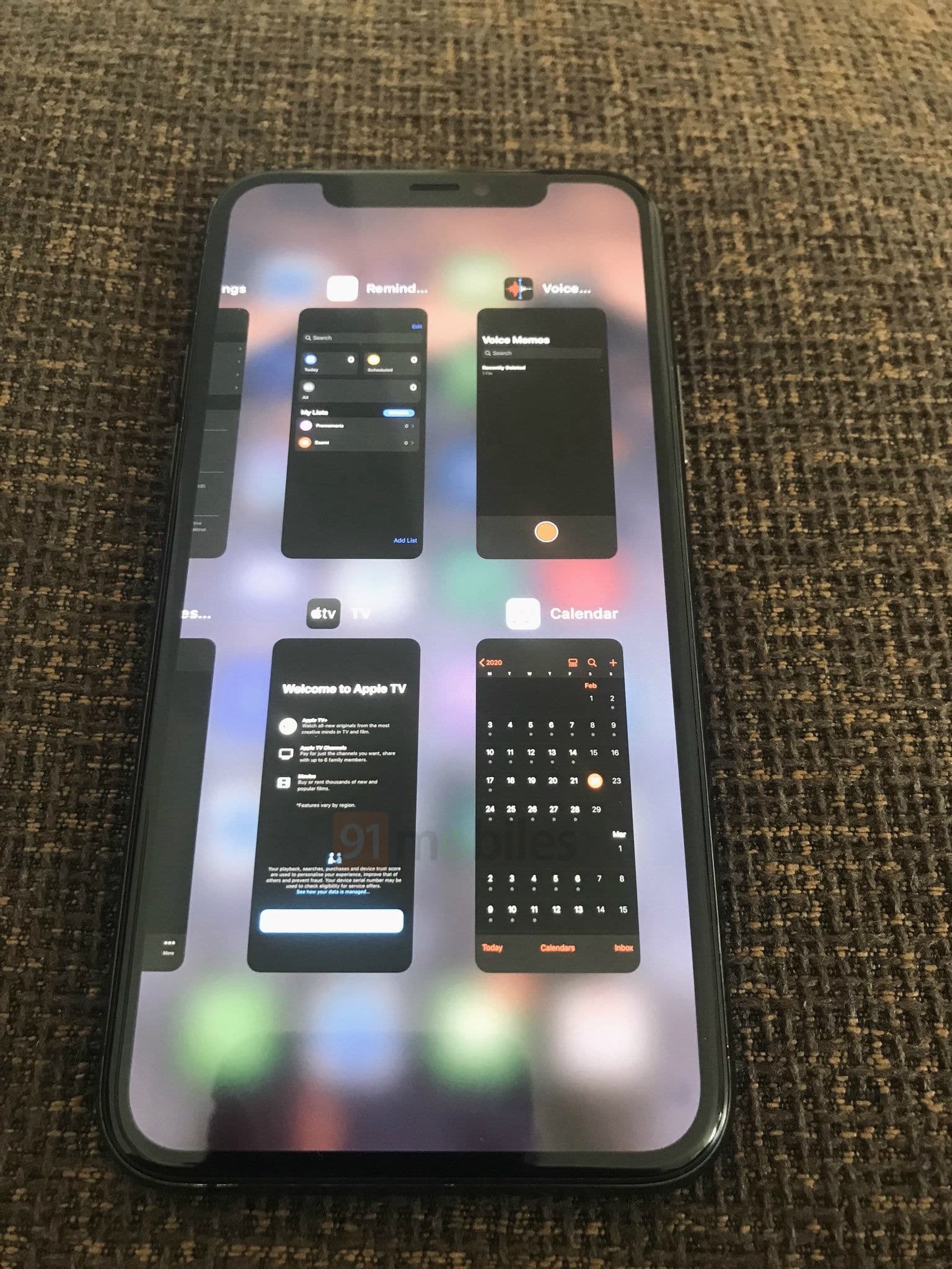
Leaker and concept designer Benjamin Geskin also revealed a new Settings page for the App Switcher, allowing users to choose between the old and new designs. The choices are “Automatic,” “Deck Switcher,” “Grid Switcher,” and “Minimum Viable Switcher.” This is a decidedly un-Apple approach, but if true it’s another welcome step towards Apple granting users more control.
Could user control be one of the key themes of iOS 14? We can’t wait to find out more.