
Apple has historically been at the forefront of accessible design. It builds considerate, powerful accessibility features deep into iOS to allow those with visual, aural, or cognitive needs to use their Apple devices as easily as possible.
But Apple’s upcoming “Liquid Glass” redesign, set to release this September with iOS 26, has sparked some concerns. This bold new look involves layered menus, over-the-top animations, shiny highlights aplenty, and lots of transparency. There are many places in the new interface where glassy buttons are overlaid directly over an app’s content, and the result is something of a legibility nightmare. And while we’d expect Apple to dial it back a bit over the course of three months of beta testing, this initial release is a little worrying.
Luckily, there are already workarounds to disable some of these flashy effects and return to a flatter, simpler interface that’s easy to read. So if you’re already trying out iOS 26 – or worried about legibility when it’s time to update – we’ve got your back.
![]()
Reduce Transparency
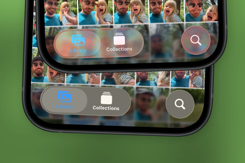
First up, head to Settings > Accessibility > Display & Text Size and look for the Reduce Transparency toggle. This setting has always been useful for improving the legibility of menus, but with Liquid Glass the difference is night and day. Anywhere Apple’s new material is present, the translucent glass effect will be replaced by a fully opaque plain background – as shown below in Control Center and Photos.
![]()
As of the first iOS 26 beta, there are still problems – some of the menu colors are difficult to parse even with transparency disabled. But it’s a start.
While you’re perusing the Display & Text Size menu, you might want to consider turning on Bold Text and/or Increase Contrast too. The result of these toggles is more subtle, but they’re a noticeable step on the road to increased legibility if you’re still struggling.
Reduce Motion
The “liquid” aspect of Liquid Glass is another thing you might want to nix. Apple has added animations that cause tab bars and toggles to slosh around as you move them, expanding and contracting and wobbling like, well, liquid. It’s a very impressive effect, but if you find it too distracting or are worried about the battery life implications, you can limit these effects.
Head to Settings > Accessibility > Motion and turn on Reduce Motion. This will limit the more in-your-face animations, although it won’t stop them completely. For example, the tabs in the Photos app still enlarge when you press them, but they don’t wobble and slosh anymore with this setting activated. Much less distracting.