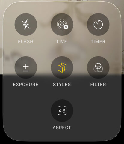
The Camera app gets a fresh new look in iOS 26, adopting the same translucent liquid glass aesthetic seen throughout the system. But it’s not just a visual update – Apple has also simplified the layout to reduce clutter and give more space to your viewfinder, making room for a taller, less obstructed preview window. It’s cleaner, but you might find it harder to access certain features with the new look. Let’s see why.
At first glance, it might look like many of the classic camera modes have vanished. Only Video and Photo are visible in the carousel, which could cause a moment of panic if you’re used to regularly switching to other modes like Portrait or Slow Motion. But don’t worry – swipe left or right and the full range of modes will reveal themselves, just like before.
As for all those extra options like flash, timer, and exposure – they haven’t been removed, just tucked away in new liquid glass pop-out menus. To access them, tap the menu button in the top-right corner or tap the name of the active mode at the bottom of the screen. For example, if you’re in Photo mode, tapping the Photo label brings up settings specific to that mode. In Cinematic, you’ll get a different, contextual menu tailored to that mode.
There are still a few quick toggles visible at the top of the screen, though fewer than before. From left to right, you’ll find buttons for switching between shared and personal photo libraries, adjusting format and resolution, toggling night mode, and controlling the flash.
One last detail that’s easy to miss: there’s now a button nestled in the top-right corner of the status bar for adjusting Photographic Styles. Tap it and you’ll get access to sliders for tone and warmth, giving you more control over the look of your images before you even press the shutter.


