
- How to arrange apps freely on your Home Screen
- Apply dark, tinted, or clear styles to your icons
- Supersize the icons for a cleaner look
Apple has steadily handed iPhone users more control over their Home Screen, and there’s now quite a lot you can do with it – from rearranging icons however you like to applying a colour wash across everything, or stripping it back to a minimal, label-free layout. Here’s a full rundown of your options.
A range of arrangements
Press and hold anywhere on your Home Screen until your apps start to jiggle. Then press and hold to drag any app or widget to wherever you like. Icons still snap to an invisible grid, but you’re no longer forced to fill from the top left – you can leave gaps, cluster apps above the dock, or arrange things to frame your wallpaper. If you struggle to reach the top of the screen, now’s your chance to put things in easy reach.

Dark mode and custom colours
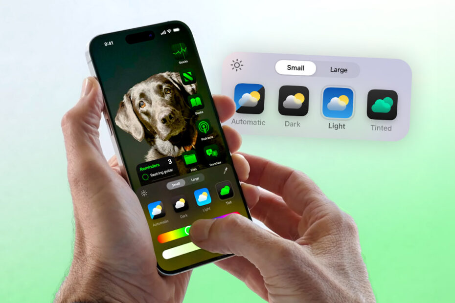
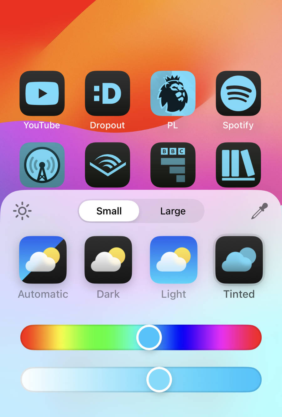
Long-press to enter jiggle mode, then tap Edit > Customize. Here you can adjust the appearance of all your icons at once.
Choose Light for standard icons, or Dark for a version that inverts white elements to black – easier on the eyes, especially at night. Auto switches between the two based on your device’s Dark Mode setting. (Tap the sun icon in the corner of this menu to quickly toggle between Light and Dark for a preview.)
Tinted washes all your icons in a colour of your choosing. Use the Hue and Brightness sliders to dial it in, or tap the eyedropper to lift a colour directly from your wallpaper.
Clear icons
iOS 26 added a Clear option, which gives your icons a frosted, translucent look – part of Apple’s broader Liquid Glass design overhaul. As before, you can choose Light, Dark, or Auto to control how it behaves with your system appearance.
Go big
Finally, you can resize your icons. Tap the size button (two squares) to switch between large and regular modes. Large makes icons significantly bigger and removes their text labels entirely – great for legibility, or for a cleaner, more minimal look. Regular is, well, what you’re already used to.
![]()
Dive in and experiment – there are enough combinations here to make your Home Screen unique.