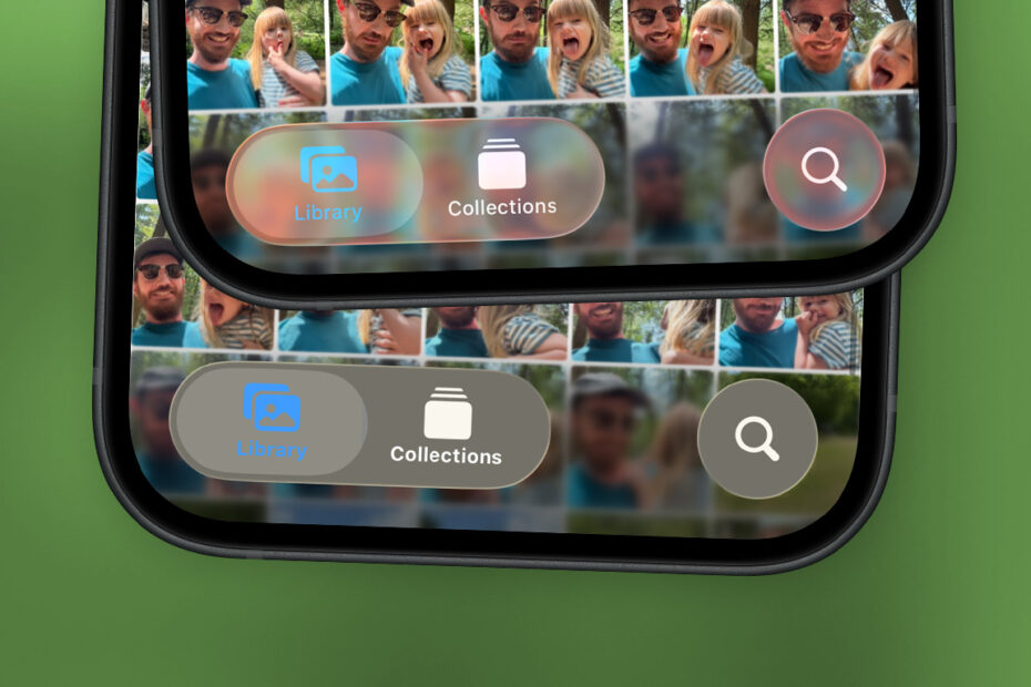

Liquid Glass is the bold visual style Apple introduced in iOS 26 – a vibrant, animated, translucent design that runs throughout the system. From floating menu buttons that shimmer with specular highlights to toggles that ripple and slosh as you interact with them, the entire interface feels fluid, layered, and alive. At a glance, it looks pretty amazing.

But as eye-catching as Liquid Glass can be, it hasn’t landed smoothly with everyone. The layered, see-through menus can be hard to read, even though the content below them is blurred. Apple has continued to tweak the design, but the broad strokes of Liquid Glass are here to stay – for better or worse.
Home Screen changes
The design also extends to the Home Screen, where you’ll find a clear icon option that makes app icons shiny and semi-transparent. To try it, long-press your Home Screen and press Edit, then Customize. You’ll find the Clear setting alongside Default, Dark, and Tinted options. This mode also drains the color from icons in other places, like the Settings app and Control Center.
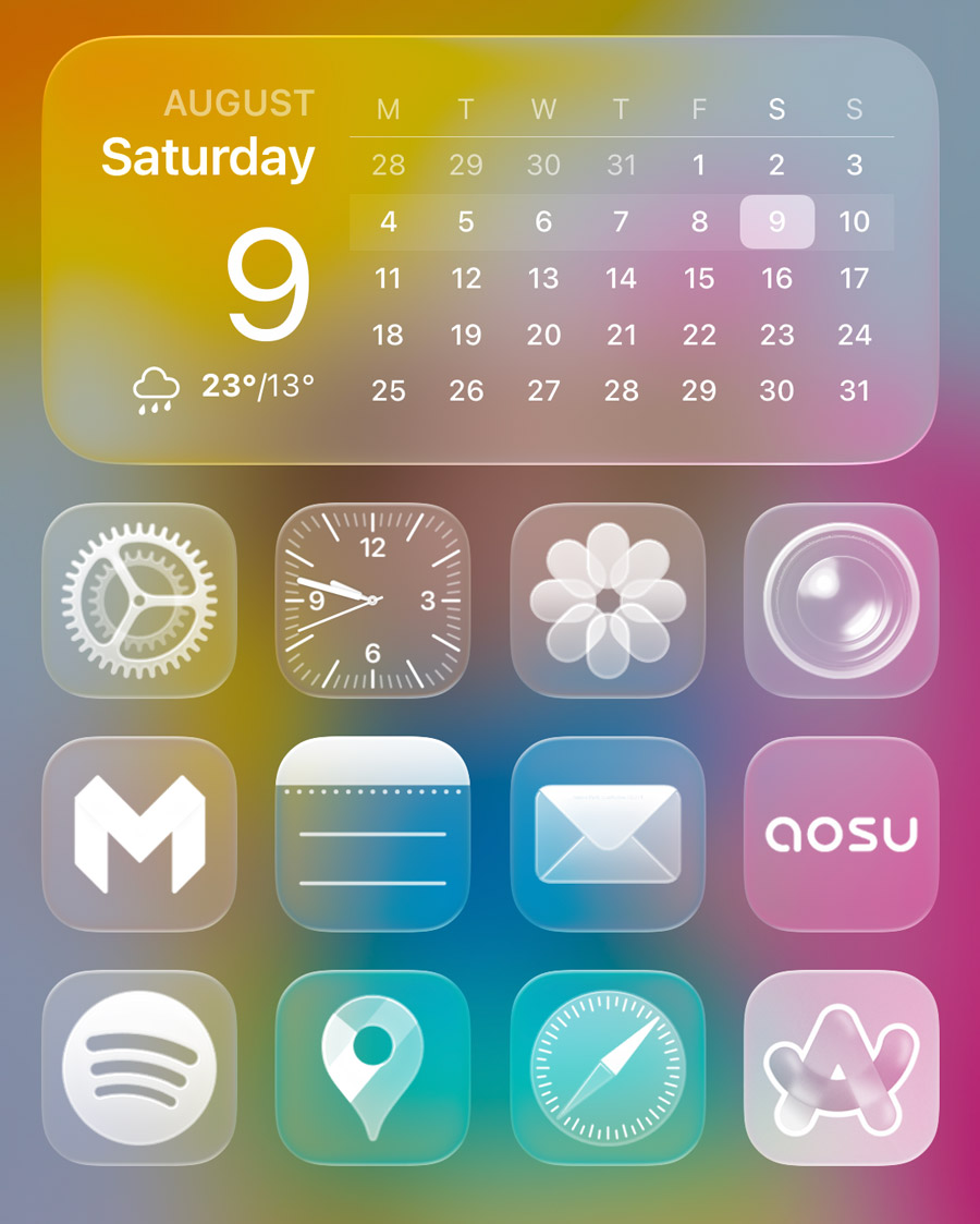
With every icon rendered in a similar transparent style, it can be tricky to tell your apps apart at a glance. Thankfully, none of this is on by default, so you should only turn it on if you really love the style.
Limit the liquid
If you’re not a fan of the look, or are struggling with legibility, there are some steps you can take.
To improve clarity, head to Settings > Accessibility > Display & Text Size and enable Reduce Transparency. This will replace the glassy background layers with solid, opaque panels, making text easier to read and menus more clearly defined.
To reduce the more animated effects – like the way buttons swell and bounce – go to Settings > Accessibility > Motion and toggle on Reduce Motion. This results in a calmer, more restrained experience.