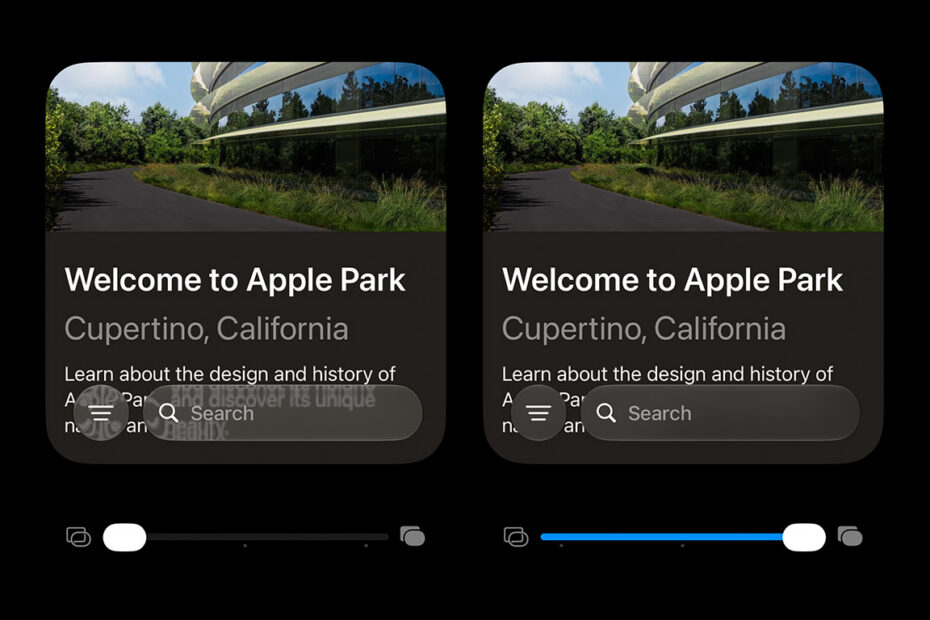

- Tune Liquid Glass to your liking with one slider
- Land anywhere on a spectrum from clear to (nearly) opaque
- Accessibility settings can take the changes even further
Liquid Glass really split opinion when it landed. As cool as the translucent bubbles look in Apple’s press shots, in reality they’re a bit of a legibility nightmare – especially for anyone with a visual impairment. In a rare move, Apple has actually listened to the naysayers and added a proper customization option in response. So whichever side of the debate you’re on, there should now be a setting that keeps you happy. It replaces the old clear-or-tinted toggle with a full sliding scale.
Note: this is a preview of an upcoming iOS 27 feature. To try it for yourself, join Apple’s beta testing program in July or wait for the public release in September.
How to adjust Liquid Glass
Open Settings, head to Appearance, then Liquid Glass. You’ll see a preview window showing how the menus look over various types of content. Move the slider beneath it from left (very clear) to right (very opaque) and let it settle wherever you prefer.
This is more than just an opacity slider – Apple seems to have tweaked a lot of details since the first version of this design language debuted. The opaque version is still glassy, but more like frosted glass than shimmering transparency. The slider can stop at any point on the scale, so you get a good amount of control to dial in exactly the level of sheen you like. For me, that’s about three-quarters across – mostly opaque, but with just a hint of the content beneath shining through.
Apple’s preview is all well and good, but below you can see a real-world example: how it affects the now playing overlay in the Music app. Notice how much of the text behind bleeds through on the clearest option (top), while the most tinted option (bottom) is far easier to read. The middle screenshot shows the default setting.

It also changes the look of the Clear and Tinted options dramatically when you’re customizing your Home screen. Below I’ve shown the two extremes. You can really see how the background colors diffuse through the icons differently – the clear option (left) shows quite busy refractions, while the tinted option (right) still lets colors through but adds a heavy blur that tones down the harsh edges.
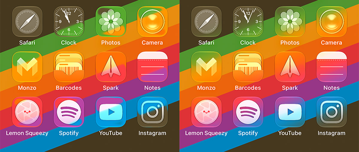
Going further
Still having trouble after dialling it in? You might want to turn on Bold Text and/or Reduce Motion from the same Appearance menu. Those stack on top of any Liquid Glass changes, so they’re worth combining.
For even more control, head to Settings > Accessibility > Display & Text Size. The catch is that the most useful options here don’t stack with the Liquid Glass slider – it’s one or the other.
Try turning on Reduce Transparency and Increase Contrast. These go much further, essentially abandoning the Liquid Glass aesthetic in favour of something far more basic and practical.