

- Tweaks to reduce glare, flicker, and blue light
- Built-in tools to monitor your visual health
- Strip away distractions and clutter
Staring at a screen all day isn’t great for your eyes – but your iPhone has more tools than you might realize to help. From built-in health tracking to a handful of display settings worth knowing about, here’s how to make your screen a bit kinder on the eyes.
Night Shift
If you do one thing on this list, make it this. Night Shift shifts the display toward warmer tones after dark, cutting down on the blue-heavy light that makes screens feel harsh and can interfere with sleep. For many people, enabling it is enough to make a noticeable difference.
Go to Settings > Display & Brightness > Night Shift. Set it to run from sunset to sunrise, or choose a custom schedule. The warmth is adjustable – you don’t have to go full amber.
More visual tweaks
Night Shift will be enough for most people. But if you’re particularly sensitive to screen fatigue, and there are a few more settings worth knowing about.
Reduce White Point cuts the intensity of bright whites, which is useful in dark environments where even minimum brightness feels too harsh. Find it at Settings > Accessibility > Display & Text Size > Reduce White Point. Around halfway is a reasonable starting point.
Limit Frame Rate caps the display at 60Hz instead of the default 120Hz found in iPhone Pro models. It sounds counterintuitive, but the higher refresh rate bothers some people more than they’d expect. Go to Settings > Accessibility > Motion > Limit Frame Rate.
On the legibility side, Bold Text and Increase Contrast are both worth enabling – they reduce the visual effort of reading menus and small text. Both are at Settings > Accessibility > Display & Text Size.
Reduce Motion, meanwhile, tones down the animated transitions throughout iOS that can quietly contribute to fatigue. That one’s at Settings > Accessibility > Motion > Reduce Motion.
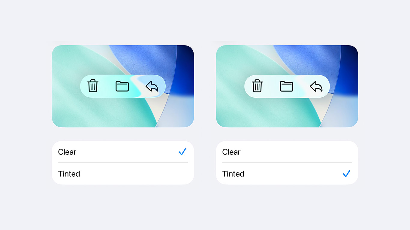
Finally, if you’re on iOS 26, it’s also worth switching the Liquid Glass design from Clear to Tinted – the default see-through menus can add visual noise that makes the interface feel busier than it needs to be. We’ve got a full guide to that here.
Screen Distance
Beyond those tweaks, Apple has a couple of features that it uses to look out for your visual health.
iPhones with Face ID can use the TrueDepth camera to monitor how close you’re holding the screen. Hold it closer than 12 inches (30cm) for too long and you’ll get a warning to back off.
It’s off by default for adults. To enable it, go to Settings > Screen Time > Screen Distance, tap Continue, and toggle it on.
For kids it’s a more significant concern – the risk of developing myopia is higher in younger users, and Screen Distance is turned on by default for children under 13 in a Family Sharing group. Worth checking it’s active.
Time in Daylight
If you have an Apple Watch, the ambient light sensor tracks time spent outdoors each day. Research suggests regular time outside – at least 20 minutes for adults, and up to 80-120 minutes for children according to the International Myopia Institute – can reduce the risk of myopia and ease digital eye strain. To see your data, open the Health app, tap Browse, then Mental Wellbeing > Time in Daylight.
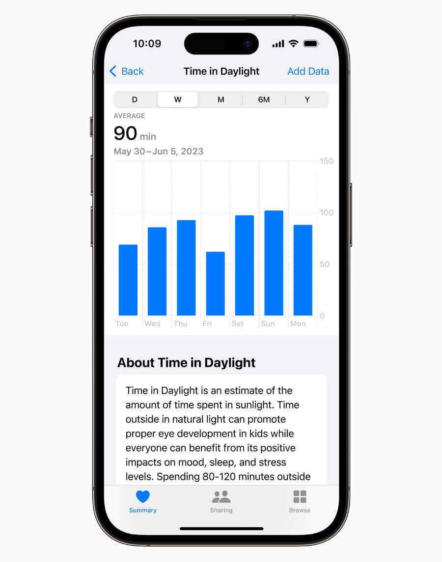
To keep an eye on a child’s daylight data, go to Settings > Screen Time > Set Up Screen Time for Family.
Reader View
One final suggestion: Safari’s Reader mode strips out ads, sidebars, and cluttered layouts and replaces them with clean, adjustable text. When you’re on an article, tap the page menu at the bottom left and select Show Reader. You can set a preferred font and background – a warm off-white or sepia tone is much easier on the eyes than a stark white page for longer reading sessions.