
The rumor mill reckons iOS 18 will give you more control over your Home Screens
WWDC has been announced, and so rumors are flying around about what new features Apple will reveal for your iPhone. As reported by MacRumors, Bloomberg claims there will be a big one this year: a Home Screen that is “more customizable”.
But what does that mean? Bloomberg isn’t saying (yet). So we thought we’d delve into how Apple could shake up your Home Screens, by bringing in ideas from other platforms. And then, inevitably, claiming them as Apple’s own.
Freeform app placement
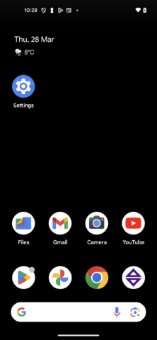
On Android, you can do this. On iOS… not so much.
The Android Home Screen is similar to what you get on iOS, allowing you to place apps and widgets. However, there’s one big difference: you choose precisely where each item goes on the screen. In other words, you can have gaps. Doing the same on iOS requires hacks. We’re not sure Android’s way is better, but we’d nonetheless like this as an option on iPhone.
Scaling and zooming
In Settings > Display & Brightness > Display Zoom, you can magnify the entire screen. But Apple could also let you scale the icons themselves, like you can in Finder on the Mac. Perhaps this could be done on a per-Home Screen basis, so you could have chunkier icons on your main screen – or a larger number of smaller ones if you wanted immediate tappable access to more apps and games.
Live icons
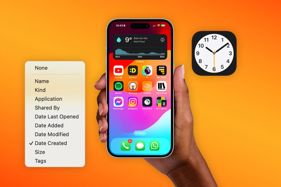
The Clock icon is an actual clock. Should more icons be ‘live’?
App icons are limited. They can display alert badges and some apps provide alternatives you can manually select. But Apple shows more potential with two of its own app icons: Clock is a live clock, and Calendar shows the day’s date. Other apps could benefit from similar freedoms, in effect turning their icons into miniature widgets. Although care would have to be taken to avoid apps pretending to be something that they’re not and ‘tricking’ users into opening them.
Sort options
Apple would argue if you have a large collection of apps, you should use Spotlight or the App Library to access them. But many people like spatial app organization. The problem is, arranging more than one or two apps on iOS is a tedious chore. That could be dealt with by integrating a Finder-like Sort By feature, ideally individually per Home Screen but also optionally for every Home Screen should the user choose. Then you could, for example, arrange a page (or all) of your apps by name or recent installs – with just two taps.
Default to App Library or AI
This is one swipe away on Android. Many more swipes are required on iPhone.
A more radical change would be a main Home Screen that always displays what it thinks you need – like a beefed-up Siri Suggestions. If that doesn’t happen, we’d like to see App Library available from the Dock (like on iPad), or via a gesture, rather than being located after your very last Home Screen. On Android, a swipe from the bottom of the screen immediately gives you a full-screen view of installed apps you can filter by search. Much better!
Custom themes and launchers
One final idea would be Apple wholeheartedly embracing Home Screen customization. Like on Android, you’d then be able to fully theme Home Screens, or replace Apple’s ‘springboard’ with a third-party launcher. But given how much Apple like retaining control and the very careful and gradual way it affords users customization options, this seems vanishingly unlikely to happen this year. Perhaps, then, it’s one for iOS 28 rather than iOS 18.