
I’m not against change. I don’t want the iPhone interface frozen in amber. But I would like Apple to stop repeating mistakes it’s been making since iOS 7, and to stop basing every operating system’s appearance on the one found in a spatial-computing headset hardly anyone bought.
Yes, I’m talking about Liquid Glass. Maybe you love it. I don’t. Either way, Apple needs to rethink some fundamentals before the iPhone becomes a permanent demo reel for a design philosophy that falls apart the moment you actually use it. Here’s how.
Put clarity first
The biggest problem with Liquid Glass is that it makes the interface harder to read. Text lacks contrast. Icons are blurry. Buttons change appearance depending on what’s behind them. In trying to make iOS more immersive, Apple made it less immediate.

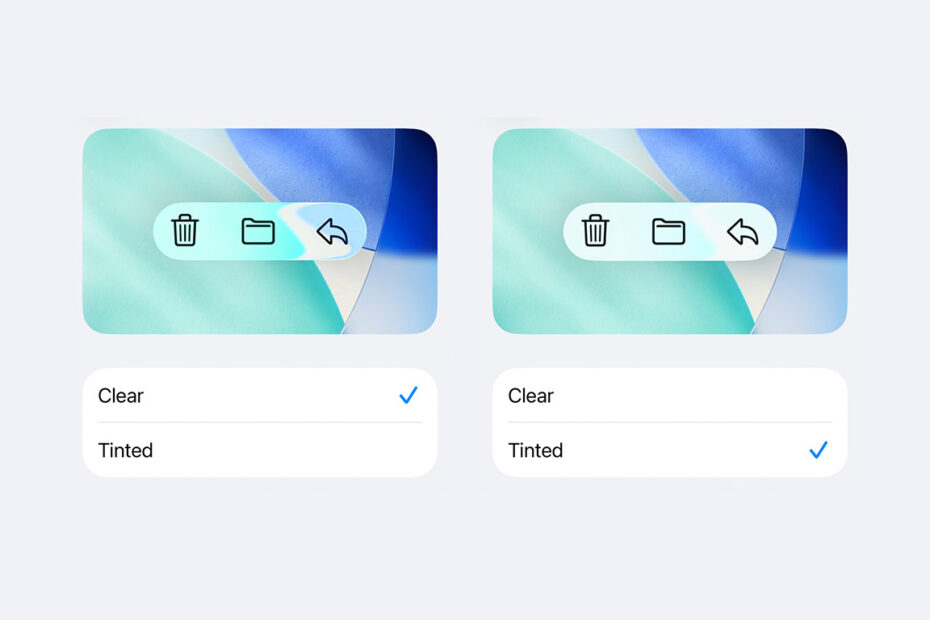
The new Tinted option for Liquid Glass.
Apple has already walked some of this back. But the “tinted” Liquid Glass option feels like an emergency patch rather than a confident design choice. And Reduce Transparency remains buried in Accessibility and comes with quirks of its own. Either way, basic readability shouldn’t be an option – it should be the foundation.
For iOS 27, I’d like Apple to rediscover visual stability. Interfaces shouldn’t shimmer as content moves beneath them. Controls shouldn’t compete with what you’re trying to read. And everything should look pin-sharp, rather than hazy and indistinct.
Design for flat screens
Liquid Glass makes sense when you remember Apple’s obsession with spatial computing. Depth, translucency, and floating layers are suited to spaces where digital objects coexist with the physical world. Perhaps Apple assumed Vision Pro would reshape computing overnight. Or maybe its designers just thought its 3D interface looked neat.
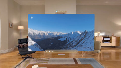
visionOS.
Regardless, visionOS ideas don’t translate cleanly to flat screens. On iPhone, iPad, and Mac, they often feel distracting rather than immersive. Fake depth effects beamed in from Hollywood movies pull focus away from content, such as hovering buttons that become more prominent than what they’re placed above.
I think Apple needs to remember that one size doesn’t fit all when it comes to design. And also that the best interfaces tend to “disappear” through restraint and visual neutrality, not because they’re literally translucent.
Make the interface feel dependable again
A lingering problem since iOS 7 has been the erosion of visual cues. Buttons stopped looking like buttons. Controls disappeared until summoned back by gestures. Discoverability suffered immensely.
Liquid Glass occasionally improves things by making some controls feel tactile again. But progress is undermined by Apple’s habit of collapsing toolbars into floating bubbles at every opportunity. The result often feels fragile and finicky.

Issues with legibility and collapsing toolbars remains.
Much of this is a problem of definition. I’d like to see Apple restore a stronger separation between interface and content. Controls should feel anchored, permanent, dependable, and reliable. Moreover, they should be recognizable – users shouldn’t have to guess whether something is tappable. Interfaces should prioritize rapid access and communication over visual bling.
Be more practical
I sometimes wonder whether modern interface designers spend too much time in front of giant screens and forget how most people use computers. Although whether that’s why Apple’s recent operating systems so often value aesthetic purity over usability, I’ve no idea.
I already mentioned disappearing controls, but the problems go deeper than that. Apple’s entire Liquid Design philosophy is supposedly about bringing greater focus to content, and yet it forgets that people want to efficiently interact with that content.
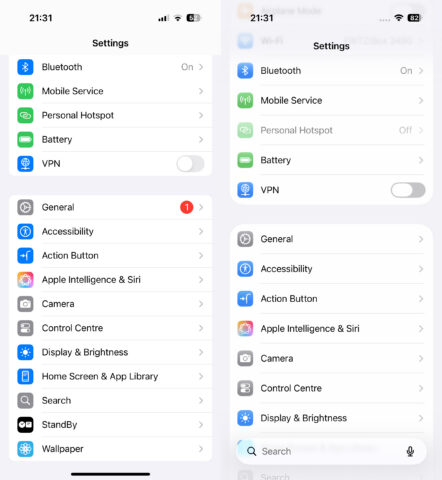
iOS 18 (left) has greater information density than iOS 26 (right).
In lists – such as in Settings – reduced information density means you now get less on screen, forcing more scrolling. Absurdly oversized window corners on iPad and Mac look toy-like, waste space, and can crop content. And endless animations make all these operating systems feel slower than they are.
Apple should remember that interfaces should help people do things efficiently, which means dialing down the lighting effects and acres of whitespace.
Remember what works
My concern last year was that Apple had started to design interfaces around concepts and marketing ideas over and above usability goals. Or, if that’s not the case, those usability goals got lost in translation, due to the company’s fixation on translucency and lighting effects.
But the best Apple interfaces throughout its history have succeeded because they were fast and frictionless. They respected attention instead of competing for it. Liquid Glass too often does the opposite, drawing focus to itself rather than what you’re trying to do.
That’s not to say Apple should abandon Liquid Glass. Even if it wanted to, another massive design overhaul after just one year would be unthinkable. But iOS 27, iPadOS 27, and macOS 27 must remember something the most successful eras of Apple software instinctively understood: interfaces are tools, not eye candy.